


About warees halal
WHL’s WHL Logo encompass two key areas:

4
WHL Logo
The meaning of the elements in the WHL logo
- The 5-stalk design is an extension of Warees’ existing 3-stalk motif, signifying the new WHL’s corporate relationship and common social mission with the prior-established Warees entity.
- The additional stalks signify future growth, dynamism and vibrancy.
- The red colour on a white background signify Singapore’s reputation in consistently upholding efficiency, zealousness, credibility, transparency and integrity in its work dealings and commitment to outcomes delivery.
- The tick-mark below the stalks alludes to ensuring an authoritative position in the certification/assurance business, with the green colour signifying Halal as both an Islamic injunction and eco-friendly ethos.
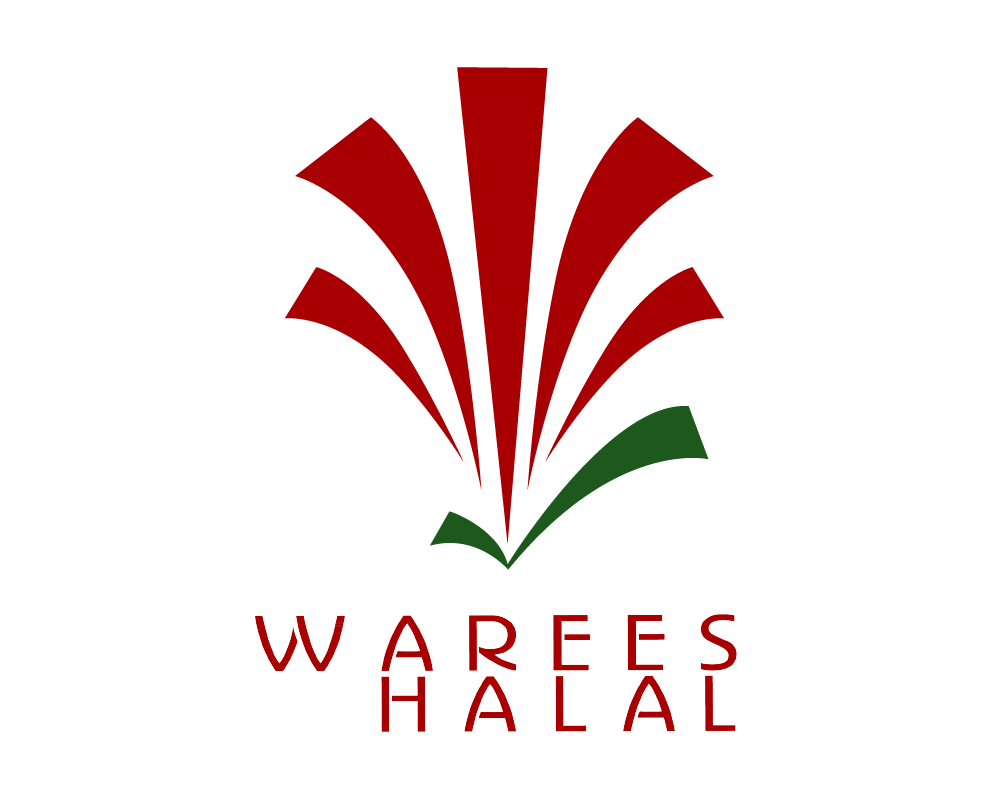
WHL’s WHL Logo encompass two key areas:

1
WHL Logo
The meaning of the elements in the WHL logo
- The 5-stalk design is an extension of Warees’ existing 3-stalk motif, signifying the new WHL’s corporate relationship and common social mission with the prior-established Warees entity.
- The additional stalks signify future growth, dynamism and vibrancy.
- The red colour on a white background signify Singapore’s reputation in consistently upholding efficiency, zealousness, credibility, transparency and integrity in its work dealings and commitment to outcomes delivery.
- The tick-mark below the stalks alludes to ensuring an authoritative position in the certification/assurance business, with the green colour signifying Halal as both an Islamic injunction and eco-friendly ethos.